WEEK #5: BEING CREATIVE
This weeks work is all about being creative with coming up with new thoughts, themes, and ideas for the design projects as well as daily creates, and the writing assignments.
The daily creates I have done this week were: Happy Birthday David, Creative Hands, and Family Tree.
HAPPY BIRTHDAY DAVID!
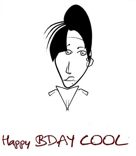
Dear David
It is nice to share your birthday with everyone and I wish I can get the same my birthday was this Friday February 13th ![]()
Happy birthday cool mustache!
_____________________________________________________________________
MAKE CREATIVE HANDS

I love creating shadows with using my hands to create different types of images. This was the only thing I can do since it was not that sunny and it was cloudy. But If I had clear wall at the moment I would have created a shadow of animal faces and other interesting things but there is always a next time!
#dailycreate #tdc1129
_____________________________________________________________________
MY FAMILY TREE
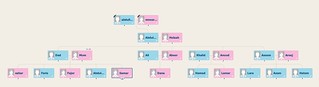
My family tree is big and interesting. I hated doing this assignment because it reminded me of sad moments of my mother’s siblings who died in the past few years. I think that having a family tree is important to remind us of our identities and culture as well. The only sad part is the death part. I’m interested to see how our family will grow up with my siblings marriages ![]()
(for a better view click here visit the image in my flickr)
_____________________________________________________________________
WHAT I THINK ABOUT THE PRINCIPLES AND THE CREATIVITY?
What I think about the principles and the creativity?
Design is a way to communicate with the viewer eyes without the possibility of using words.Massimo Vignelli focused in his booklet on how young designers have the lack of typographic principles. I agree with him that creativity needs the support of knowledge and the designer’s ability to preform and apply the methods. In pragmatics the writer talked about how we should look at designs and I agree with him based in personal experience.
I have made many designs for my internship the was for Hats, Heels & Ties where I designed their art work for procures and adds for the big event supporting kids with autism. I will make the design thinking that it is perfect and understandable but having a second eye looking at the design always helps identifying issues and fixing them before they go out. Discipline and appropriateness are also very important principles of design, details and the theme make the ending product valuable.
Vignelli also mentioned the visual power as a design principle. Choosing the right format, colors and sizes make the design pop-out to the viewer eyes. These are important but they are not everything to maintain visual power. For example, the layout of the materials also makes a good design. Visual strength is important in design and should not be confused with visual impact.
Identity and diversity is also a design principle that Vignelli talked about in his booklet. Too much diversity could break the design, and a little of it could make the design poor. Same goes to identity creates perceptive redundancy as Vignelli referred to it and it is an important term in design. Just the right amount of both Identity and diversity is the way to make a perfect design.
I think some of these principles take practice more than just reading about them. By applying the right amount of principles into the design such as balance, proportion, contrast, size, responsibility, sequence, and unity, the design can be outstanding an eye-catching. In the end it is all about the practice that will make a designer apply all the rules needed to make his pease the one that will bring him/ her to light.
#vignelli
_____________________________________________________________________
FILM DESIGN
Double Indemnity
Think about the built environment of Los Angeles in the 1940s, the 1990s for Lebowski, or, in the case of Blade Runner, 2019. How does space help frame the design and style of noir in these films? What design elements of noir are not specific to a particular time and place?
Based on the american film noir Double Indemnity, the built environment in the 1940s is very dark film in terms of the theme. The starting of the movie shows violent, dark theme, scary music, and noise as well. The guy with the hat and the long black jacket has wired personality and activities. The shadows in the movie represent noir and the way they images were delivered to viewers. The lightning techniques that were used make the image interesting but people might not notice them. For example showing only half of the actor’s face to represent the double personality. The way that the window shade in the actor’s face and wall. The wife was imaged as a dark, evil, fake, and unfaithful person by the way she smiles, dress, act, make up, accessories, and the wig she wears. The way the wife and walter meet and the way their faces are covered where he will be wearing a hat the whole time do the shadow of the hat covered his eyes. Walter walking on the dark and when he got to the car the reflection of his face in the mirror when his wife claimed to go check the car. The way they where sitting in the car and the dark lightning in her face. The way walter was walking on the train on the middle and he looked dark where the people seated to his left and right where light and their facial expressions are easy to view. All these are lightning techniques that were used to make it easy to reflect their characters and personality.
#filmdesign
_____________________________________________________________________
Moving to Design assignments I did 12 stars this week
CREATE YOUR OWN DS106 WALLPAPER!

One of the 4 stars design assignments I made was creating your own DS106 wallpaper. This is the background I have created to simples both DS106 and my noir character. My noir character is supposed to be that sassy dancer who is also good at what she does which made her live her only child at her mother’s house to go and dance at a casino in Las Vegas. Hope you like my design and the color themes.
#DesignAssignments #DesignTutorials1491
_____________________________________________________________________
MINIMALIZE YOUR PHILOSOPHY
“Pick your favorite quote OR make up your own phrase which describes a philosophy that you try to live by. It can be about love, friendship, family, education, culture, health, charity, etc. Design a minimalist poster depicting the concept. Extra challenge: Try to include a unique element that makes it YOU. Don’t forget to explain your thought process. :)”

This assignment is 2 and a half and I chose to do this assignment because there is one role in life that I follow the most. “Fear your enemies but fear close ones more,” in this role “close ones” are friends, family, and loved ones. These people could hurt you more because yo least expect it from them. I have got hurt so many times from people who I least expected to hurt me. Sara my character is an independent woman who is good at what she does, does not care what people around her think of her as long as she is happy. I think I am trying to make Sara what I wanted to be from the beginning. I do not want her to make the same mistake I made by trusting people too much. In the coming up assignments you will figure out Sara’s story.
#DesignAssignments #DesignAssignments365
_____________________________________________________________________
ONE STORY/ FOUR ICONS
“The assignment is to reduce a movie, story, or event into its basic elements, then take those visuals and reduce them further to simple icons, four of them. Write your blog post up but do not give away the answer, let people guess! The challenge is to find the icons that suggest the story, but do not make it so easy. For icons a great resource is The Noun Project.”

This assignment is 2 and a half stars. What inspired me to pick this story is that I was watching a movie earlier this week and this movie got me. Very emotional and it happens a lot I hope my classmates and the teachers can get what it is. Feel free to write a comment with the answer and I will write back!
#DesignAssignments #DesignAssignments358
_____________________________________________________________________
WAIT, WHERE’D THAT GUY COME FROM?
Photoshop someone(s) (or something(s)) into a picture that isn’t supposed to be there.

This assignment is worth 3 stars and it is about attaching a random person or something in a picture. What made me want to go for this assignment and pick a person instead of a thing is the fact that this happens a lot where I will be taking a group picture of my family and I or my friends and I ,and someone will just pop-up in the picture like I do not care. Sometimes they smile too, Which makes it even a lot weird. I learned it the hard way to look first and then take a picture. Here is my picture with the random person in it. Let me know if you can find the person!
#DesignAssignments #DesignAssignments149
_____________________________________________________________________
DESIGNBLITZ
Unity
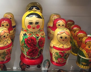
For starters, I took this picture this Friday at the gift shop in the Fine Arts Museum down in Richmond. We used to have some of those at our house and my grandma used to always point at them and say “They look the same but they have different sizes but together they are equal and unique. You cannot separate them if one goes missing the whole set will ruined.” I have lost of the 7 pieces we had at home and every time I look at then I know one is missing because each one has a different size. This is what made me pick this object to represent unity.
Balance
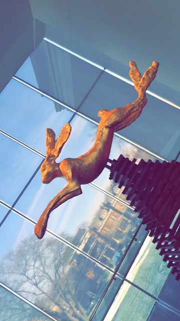
This peace is also at the Fine Arts Museum in Richmond. This one represents balance. The way the rabbit is held from the middle shows how to balance an object. I thought this was a unite peace at the museum. The golden rabbit arms and legs and the way they balance each other. All these details show balance in the design.
Color
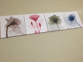
These are some paintings I have purchased recently to decorate my bedroom They colors actually represent each season. Starting from the left brown represents fall season, red represents summer, green represents spring, and the blue represents winter. I decided to put them this way because brown represent the problems I go through in life, red represents the same issues going bigger, green represents the solutions, and blue represents the new thoughts I develop in life. It is a way to cheer me up no matter what I go through in life. I guess the colors here have to go together otherwise something will seem missing, either to much dark colors or to much bright colors. The right balance of the colors makes these paintings standout. This is what I chose to represent colors.
Rhythm
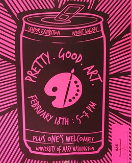
This add was hanged around campus about an event coming soon. The way they used the paint and brush in the middle of a bottle is unique. I don’t see it that much. I’it a little hard to guess what they were going for from the first glance at it. After a while of looking at it I noticed they where going for how art makes simple things amazing and standout. The reason what I picked this one for rhythm is because of the lines the are going around the can. This design made the can and the words pop-out and catch the viewers attention not only because of the can’s size and the fact that it is in the middle of the paper but the rhythm going around it made it unique and simple.
#designblitz
_____________________________________________________________________
COPYRIGHT & CREATIVE COMMONS
My own impression of copyright low, fair use doctrine and the creative commons movement?
Copyright is very important for the owner but not as much for receivers. Sharing my work with other to share knowledge doesn’t mean they can use my work without referring it to me. I have had a bad experience with some social media app when I had posted pictures I have taken myself to find it on another account where the person have used it referring the pictures to himself instead of tagging me. After what happened I stopped posting pictures for a while till I found an app where you can sign your picture of video with your name. Copy rights are very important and not everyone these days go by it. No matter how much they inform on it. People don’t like to pay to listen to music or watch movies. They like to download things for free. Use other people work without referencing them. I think their no single way in how to stop this issue from continuing. People need to realize themselves that what they are doing is wrong and unethical. I’m defiantly with copyrights being enforced.
#copyrightthoughts
This is all the work for this week feel free to play around and check out my pages and leave comments and ideas ![]()


